
30 July 2026 · Editorial Team
Mixing Wood Tones with Replica Furniture UK (2026 Guide)
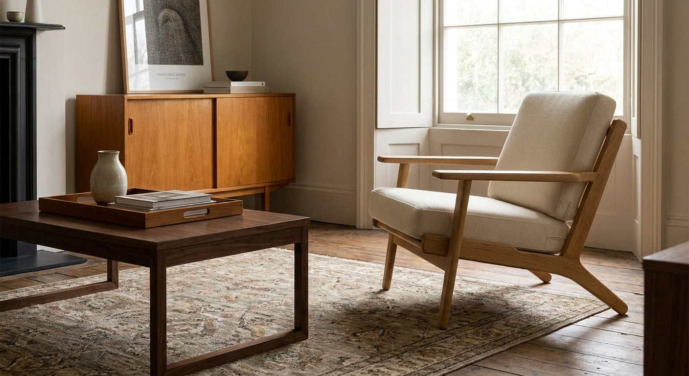
Mixing wood tones with replica furniture UK-wide comes down to one skill: reading undertones before you read color depth. Get that right and an oak Wishbone chair sits comfortably next to a walnut sideboard; get it wrong and the room looks like a furniture showroom floor with no plan.
- Mixing wood tones replica furniture UK style works on a 60/30/10 split, not a 50/50 fight between two woods.
- Match undertones first (yellow, red or grey), not just how dark or light a piece looks.
- Cap a room at two to three wood tones in 2026 - a fourth almost always reads as clutter.
- Black metal legs or frames act as a neutral break between clashing tones - buy replicas with this option specifically.
- Test swatches in daylight and lamp light before committing - tone shifts more under warm bulbs than most buyers expect.
Why this matters
Replica furniture buyers in the UK often build a room piece by piece over months, not in one order. That's how a light oak dining table ends up next to a dark walnut console bought six weeks later with zero plan for how the two would sit together.
The fix isn't buying everything from one finish. It's understanding which combinations work and which fight for attention. The same logic that governs how to mix replica and vintage furniture applies here - contrast with intent, not by accident.
Get the undertone matching wrong and even expensive replica pieces look cheap next to each other. Get it right in 2026 and a mid-range room reads as considered, not accidental.
What you'll need
- A tape measure and a note of your existing wood tones (flooring, skirting, any pieces staying in the room)
- Wood swatches or a sample panel from at least two finishes you're considering
- A daylight-facing window and a lamp for testing tone under two light sources
- One anchor piece already chosen (a table, a sideboard, or a statement chair)
- A willingness to cap the palette at two to three wood tones total
The steps
1. Audit what's already in the room
Walk the room and list every wood surface already fixed in place: flooring, doors, skirting boards. These aren't optional in your palette - they're already voting.
A room with mid-oak flooring has effectively chosen its dominant undertone before you buy a single piece. Ignore this and you'll fight the floor for the life of the furniture.
Common mistake: picking a favourite chair finish in isolation, then discovering it clashes with 40 square metres of flooring you can't replace.
2. Choose one anchor piece
Pick the largest or most visible wood item - a dining table, a media unit, a bed frame - and let its tone set the baseline for everything else. Everything else in the room reacts to this one decision.
If your anchor is a mid-century sideboard, that finish becomes your reference point for every other wood purchase in 2026, not a piece you match retroactively.
3. Apply a 60/30/10 split across tones
Treat wood tone the way you'd treat paint colour: one dominant tone at roughly 60% of visible wood surface, a secondary tone at 30%, and an accent tone at no more than 10%.
A living room with a light-oak floor (60%), a mid-walnut coffee table (30%), and one dark-stained accent stool (10%) reads as layered. Flip that ratio to near-even thirds and the room reads as unplanned.
4. Match undertones before matching depth
Wood tones split into three undertone families: yellow (most oak), red (cherry, some walnut), and grey (ash, some modern walnut). Two woods can be similar depth and still clash if one runs yellow and the other runs grey.
Hold your swatches next to each other in daylight. If one looks noticeably warmer or cooler than the other, they're fighting, even if the shade card lists them as "similar oak tones." Pieces like the oak and walnut Wishbone bar stool are useful precisely because the finish options are named by undertone family, not just "light" or "dark."
5. Use black metal or matte black frames as a neutral break
When two wood tones genuinely need to sit in the same sightline - a chair beside a table, for instance - a black-framed piece between them resets the eye. Black reads as neutral against almost any wood undertone.
This is one reason chairs offered in multiple shell finishes work well for mixed rooms: a rosewood vs walnut Eames-style shell paired with black steel legs sits between warm and cool tones without picking a side.
Common mistake: adding a third wood tone as the "neutral" - wood is never neutral, only black, white, or metal genuinely resets a clashing pair.
6. Test samples under two light sources
Oak that looks honey-warm under a north-facing window can look almost grey under a 2700K lamp, and vice versa for darker walnuts. Test any swatch in both daylight and evening lamp light before ordering full-size pieces.
Give this at least 48 hours across one full day-night cycle. Rushed swatch decisions are the single most common cause of "it looked different online" complaints.
7. Balance grain pattern and sheen, not just colour
Two pieces can share an identical hex code and still clash if one has a tight, subtle grain and the other has a loud, open grain with a high-gloss finish. Match sheen level (matte with matte, satin with satin) as carefully as you match colour.
Expected outcome: a room where wood pieces read as chosen together, even though they were bought across several months and different retailers.
8. Reassess after the room is fully furnished
Wood tone perception shifts once soft furnishings, rugs and wall colour are in place. Walk the finished room again after everything is installed and check the 60/30/10 ratio still holds visually, not just on paper.
If one tone now reads as dominating more than 60% of the visible wood, a rug or a textile layer can visually rebalance the room without buying new furniture.
Troubleshooting
Two wood tones are fighting for attention. Add a rug, a runner, or a textile layer between them to break the sightline - this is faster and cheaper than replacing either piece.
The room feels too matchy. Swap one piece for a black-framed or upholstered alternative. A room with three identical wood finishes reads as a furniture set, not a curated space.
Grain patterns clash under artificial light. Move the lower-priority piece out of direct lamp light, or swap it for a tighter-grain alternative in the same tone family.
Dark wood pieces make a small room feel smaller. Cap dark wood at the 10% accent tier in rooms under roughly 15 square metres, and lean on lighter tones for anything at floor level.
A budget replica looks plasticky next to a genuine veneer piece. This usually isn't a tone problem - it's a finish-quality problem. Check for the giveaways covered in how to spot low-quality replica leather before assuming the wood pairing is at fault.
The undertone looked right in the shop and wrong at home. Retail lighting is almost always warmer than domestic bulbs. Always retest swatches at home before final purchase.
Tools and resources
- A physical swatch card from each finish under consideration - screen colour is not reliable for undertone matching
- The 60/30/10 ratio, applied by eye across visible wood surface, not by piece count
- A reference piece already in the room, chosen before shopping for anything new
- Guidance on mid-century sideboards if you're anchoring a room around a media unit or storage piece
- A note of your flooring undertone, taken in daylight, before you order anything
What to do next
Once the wood palette is set, the next decision is usually upholstery colour against those tones - and that's where most rooms either come together or fall apart in the final 10%. Read the guide on mixing replica and vintage furniture linked earlier in this piece before adding a third furniture era into the mix.
FAQ
How many wood tones should I mix in one room?
Cap a room at two to three wood tones total in 2026 - a dominant tone at roughly 60% of visible wood, a secondary at 30%, and an accent at no more than 10%. A fourth tone almost always reads as clutter rather than layering.
Is it better to match wood tones exactly or contrast them?
Contrast, deliberately, rather than match exactly. Two nearly-identical wood tones sitting side by side often looks like a mismatch, while two tones with a clear ratio and matched undertone read as planned.
What's the difference between wood tone and wood undertone?
Tone is how light or dark a wood looks; undertone is whether it leans yellow, red or grey. Two woods can share the same depth and still clash if their undertones differ, so match undertone before depth.
Can I mix oak and walnut replica furniture in the same room?
Yes, oak and walnut is one of the most common pairings in UK interiors and works well when oak takes the dominant 60% share and walnut sits at 30% or less. Check both pieces in daylight to confirm the undertones align.
Does black metal furniture help when mixing wood tones?
Yes, black metal or matte black frames act as a neutral break between two wood tones that would otherwise clash. This is why many replica chairs and tables now offer a black-frame option alongside the wood finish.
Why does my replica furniture look a different colour at home than in the shop?
Retail lighting is usually warmer than typical home lighting, which shifts how wood undertones read. Always test a physical swatch under your own daylight and lamp light before ordering full-size pieces.
Should flooring count as one of my wood tones?
Yes, fixed wood surfaces like flooring and skirting boards count toward your total wood tone budget since they're visible in every sightline. Most rooms should treat flooring as the dominant 60% tone rather than adding a fourth separate finish.
What's the biggest mistake people make mixing wood tones with replica furniture?
Buying pieces one at a time without an anchor tone chosen first, which leads to a room with three or four competing finishes and no dominant tone. Choose the anchor piece before shopping for anything else.
One last thing
The ratio matters more than the specific woods you pick. A room built on 60/30/10 with oak, walnut and black metal will outlast almost any trend-driven single-tone room bought new in 2026, because the structure - not the finish - is what keeps it from looking dated.


